Understanding Color Theory in Painting: A Beginner’s Guide
Color is one of the most fundamental elements in painting, capable of shaping the mood, depth, and emotional resonance of a work. For those beginning their journey in visual arts, grasping the underlying principles of color theory can transform an intuitive process into a more deliberate and structured practice. This guide introduces the essential concepts of the color wheel, explores harmonious color schemes, and examines how contrast can be used to create visual interest and depth. By understanding these foundations, artists can make informed choices that enhance their expressive potential.
Color theory is not a rigid set of rules but a framework for understanding how colors interact and how human perception responds to those interactions. Historically, artists and scientists have developed various models to organize colors, leading to the modern color wheel that serves as a central tool for painters. This guide breaks down these concepts into accessible steps, allowing beginners to build a solid base for further exploration. Rather than prescribing fixed formulas, it aims to provide clarity on the relationships that govern color harmony and contrast, enabling artists to experiment with confidence.
The Color Wheel: A Foundational Tool
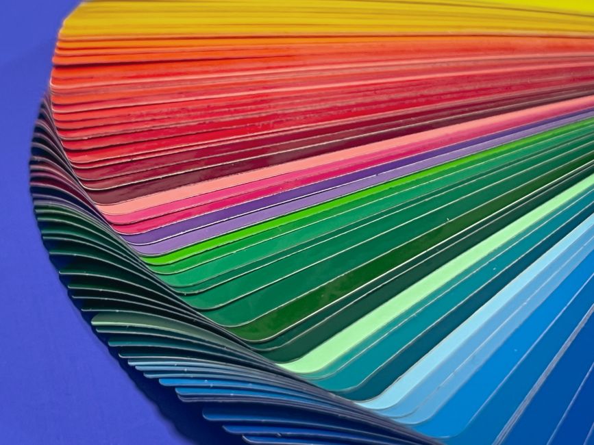
The color wheel is a circular diagram that organizes colors based on their chromatic relationships. It is typically divided into primary colors (red, blue, yellow), secondary colors (orange, green, violet), which result from mixing two primaries, and tertiary colors, created by mixing a primary with a secondary color. This arrangement helps artists visualize the spectrum and identify relationships such as complements and analogous groups. The wheel is not just a static chart but a dynamic reference that can guide mixing, contrast, and composition.
In painting, the color wheel aids in predicting the outcome of mixing pigments and in planning the overall palette of a piece. For instance, complementary colors—those opposite each other on the wheel, like red and green or blue and orange—tend to enhance each other when placed side by side. Understanding the wheel’s structure allows painters to create harmonious or intentionally clashing effects. Moreover, the wheel can be used in various scales, often adjusted for different color models (such as additive or subtractive), but the fundamental relationships remain consistent for most painting practices.
To effectively use the color wheel, it is helpful to categorize colors into warm and cool groups. Warm colors (reds, oranges, yellows) typically appear to advance, while cool colors (blues, greens, violets) tend to recede. This knowledge can influence how artists create a sense of depth in a two-dimensional surface. By thoughtfully selecting colors from different positions on the wheel, painters can guide the viewer’s eye and create a balanced composition. The color wheel thus serves as a map for intentional color decisions.
Complementary Color Schemes: Creating Vibrancy and Contrast
Complementary color schemes involve the use of colors that are opposite each other on the color wheel. When placed adjacent, these pairs often appear more intense and vibrant because each color enhances the other’s saturation. This effect is due to the way human vision processes complementary stimuli, leading to a visual vibration that can be used to capture attention. In painting, this technique is frequently employed to highlight focal points or to bring energy into a composition.
An example is the pairing of blue and orange. A blue sky with orange accents can make areas of the painting stand out. However, using complements requires careful handling of proportions and intensity; equal amounts of both colors might appear harsh, while varying their relative dominance can create a more pleasing balance. Additionally, painters often utilize complementary colors to create shadows. For instance, adding a touch of violet to the shadow of a yellow object can produce a more lifelike depth than simply using black. This method leverages the color wheel’s relationships to achieve a nuanced result.
Beyond their visual impact, complementary colors can also affect spatial perception. A small area of a complementary hue placed within a larger field of its opposite can create optical illusions of depth and movement. Artists can exploit this to guide the viewer’s gaze. However, the effect is not automatic; it depends on factors like saturation, value, and the surrounding context. Experimenting with complementary schemes is a valuable exercise for beginners to understand how colors interact dynamically on the canvas.
Analogous Color Schemes: Creating Harmony and Cohesion
Analogous color schemes use colors that are adjacent on the color wheel, such as blue, blue-green, and green. This approach typically produces a serene and cohesive look, as the hues share similar undertones and blend seamlessly. Analogous palettes are often found in nature, which contributes to their perceived harmony. For painters, this scheme is an excellent way to establish a unified mood without the high contrast of complementary pairs.
When working with an analogous scheme, it is advisable to choose a dominant color to set the overall tone, then use the neighboring colors as accents. This variation in value and saturation can prevent the composition from becoming monotonous. For example, in a seascape, an artist might use a range of blues and greens, varying the lightness to suggest waves and depth. The lack of sharp contrast makes analogous schemes ideal for evoking calm, introspection, or subtle transitions. However, they also risk appearing flat if the values are not carefully managed; introducing a darker or lighter manipulation of the same hues can add needed dimension.
Analogous colors also facilitate the creation of gradients and smooth transitions in painting. Because the hues are closely related, blending them yields natural gradations that can represent lighting changes or atmospheric perspective. This technique is particularly useful in creating realistic skies or water. Yet, analogous schemes can sometimes lack visual excitement; adding a complementary accent, even sparingly, can introduce a dynamic focal point. Understanding when to break the harmony demonstrates a mature grasp of color relationships.
Contrast and Emotional Impact: Using Color to Convey Depth and Feeling
Contrast is not solely about light and dark; it also encompasses differences in hue, saturation, and temperature. Utilizing contrast effectively can create a sense of volume, space, and emotional intensity within a painting. For instance, a high-contrast composition with stark differences between light and dark values often conveys drama and tension, while a low-contrast palette may evoke serenity or nostalgia. Painters deliberately manipulate these elements to guide the viewer’s emotional response.
Warm and cool contrast is another powerful tool. Juxtaposing a warm subject with a cool background can make it pop, as the temperature difference creates depth. This technique is frequently used in portraiture, where a cool blue background can make the warmth of skin tones stand out. Similarly, using saturated colors against muted colors can direct the eye. The interplay of contrasting hues can also alter the perceived size of shapes, with warm and light areas appearing larger than cool and dark ones. These perceptual effects are grounded in how our visual system processes color, and they provide painters a palette of techniques for expressiveness.
Emotion is intrinsically linked to color, but the connections are not universal; cultural and personal experiences shape individual responses. Nonetheless, certain patterns emerge: reds and oranges often signify passion or danger, while blues and greens are associated with calm or sadness. A painter can utilize these tendencies to reinforce the narrative or theme of a piece. However, the emotional impact is not solely due to hue; the context, juxtaposition, and overall composition all contribute. Therefore, instead of relying on stereotypes, artists may explore how color combinations create unique atmospheres. The goal is to develop a vocabulary of colors that can be used intentionally to evoke a desired atmosphere, while acknowledging the complexity of perception.
Depth can also be suggested through color manipulation, such as atmospheric perspective, where distant objects are rendered with less saturation and lower contrast, often taking on a bluish tint. By systematically implementing these principles, painters can create a convincing sense of space on a flat canvas. This process is not about copying nature but about using color relationships to shape the viewer’s experience.
Practical Exercises for Beginners
To internalize these concepts, beginners can engage in a series of exercises that build observation and mixing skills. One effective practice is to create a color wheel from primary colors, mixing each step carefully to understand the transitions. This not only reinforces the relationships but also improves color mixing proficiency. Another exercise is to paint a monochromatic study in a single hue, but varying its value and saturation to understand how these dimensions affect mood and legibility.
Exploring complementary and analogous schemes can be done through simple still-life setups. By painting the same subject multiple times, each time using a different scheme, artists can directly observe how color choices alter the visual impact and emotional tone. Additionally, studying the works of established painters through the lens of color theory can provide valuable insight. Analyzing how they arrange colors to achieve certain effects can inform one’s own practice. However, it is crucial to remember that these exercises are not about producing finished pieces but about accumulating experience and intuition.
The journey of learning color theory is ongoing. As beginners become more familiar with the principles, they may develop personal shortcuts and preferences. The ultimate aim is to reach a point where color choices become almost instinctual, guided by a deep understanding of the relationships. Encountering unexpected results is part of the process; each painting offers an opportunity for learning. By maintaining curiosity and a spirit of exploration, artists can continually refine their use of color, making each work a deeper expression of their vision.
Color theory is not a set of restrictions but a lens through which the infinite possibilities of color can be appreciated with greater clarity.